Wednesday, 4 December 2013

Iron Man 3

Budget -
$200 million - Due to CGI/Special Effects, Props such as 'Audi R8' etc. and modern technology. American Film Production Companies can take risks as they have multiple movies profiting all at once. If one of the film's flop, then the many others will hopefully equal that particular movie's loss.
Stars -
Roberto Downey Jr.
Started his career at age 5 and has now starred in over 70 productions both in film and TV (e.g Sherlock Holmes, Annie McBeal)
As a result of this, he is now popular with ALL age groups
Gwyneth Paltrow
Born into an already "film-successful" family (Father - producer/director, Mother - actress)
A celebrity from the very start (First film at the age of 17yrs old)
Attractive factor - Many young women look up to her as a role model
Genre -
A Superhero film with elements of romance, comedy and action.
The hybridity of the film attracts all audiences from a large age range. This increases the profit of the film making it more successful than any other film with a selective genre. The romance aspect would interest females whilst intriguing most males with the action included in the film. Accommodating these sub-genres into a predominant Superhero film helps to gain audience appeal.
Box office -
$1.25 billion + ($750 million in franchise)
Iron Man 3 profited so much that it came 5th place on the "All Time Worldwide Box Office" list. This was aided by the first instalment of Avengers Assemble being so successful as it introduced many more cinema-goers to the world of Iron Man which was released a year earlier than Iron Man 3 and also came 3rd in the ranking, only overtaken by Avatar and Titanic.
Production - 
Marvel Studios presented Iron Man 3 in association with Paramount Pictures (which has hosted all Iron Man movies in the past) but was also co-financed with a Chinese film production company "DMG Entertainment." Marvel made this decision predominantly for two reasons. It means that the film has more money to spend on the production and that DMG Entertainment along with Disney China will distribute Iron Man 3 in China which has an enormous audience resulting in enormous profits.
Certificate - 
Surprisingly, for such an action packed and violent movie, this film managed to scrape a PG certificate by the BBFC (British Board of Film Classification.) This allowed the maximum audience to see the film in cinema, allowing for the maximum profit to be gained.
Marketing - 
Any film company will undergo a series of marketing plans to spread the awareness of the specific movie in the means of posters and trailers alike. However, none had the dexterity and enormity like that of Marvels' S. H. I. E. L. D superheroes 'big' plan. If it weren't for The Avengers franchise or any of the other Marvel franchise, Iron Man 3 would not have been the success that it was. Being as it was one of the latest Marvel films, the audience would have therefore been at its biggest.
Issues surrounding Iron Man
Robert Downey Jr. was paid $50,000,000 for this movie
Although this may seem a lot of money, it was less than 5% of the total profit gained from the movie.
Awards -
Oscar
Nominated Best Achievement in Visual Effects (Won by Gravity)
BAFTA
Nominated Best Special Visual Effects (Won by Gravity)

Tuesday, 19 November 2013

Reflective Analysis - Group Film


Working in a group of five for an amateur 30 second production is a near-impossible task. At the very most one should be in charge of camerawork and on the other side of production no more than two should take control over the editing, otherwise contrasting themes within the sequence would be extremely obvious and recognisable to the audience. Overall, this significantly impacted on our group’s efficiency and creation; negatively but astonishingly in a positive way as well. The upside being that creating our storyboard from scratch was relatively straight forward and fast due to the large number of people throwing in ideas for our horror themed production. After a long 10 minutes we were ready to film.
                Inexperience became the better of us and, as a whole, we decided to abandon our planned storyboard and pre-drawn frames. This, on reflective analysis was unwise and foolish. Making the most of the surroundings we decided a spiral staircase was a good a start as any. The rain hammering down on the window next to the stairs was first-class icing to our disorganised and haphazard cake. Little did I know that I was to be the protagonist in our captivating motion-picture however resentful I was to agree with this, due to the plain and clear fact that I’m not in Drama but rather in Film Studies.  Nonetheless, filming commenced and the day after we started our editing process. Down to a manageable three people in our group we had ample time to put across our interpretations and ideas regarding the horror genre. Rearranging the clips that we had filmed and choosing the best ones was a complicated and drawn-out chore and I believe that if we did stick to our storyboard, we would have found this experience to be much less stressful and difficult. Afterwards, we decided that we needed to include non-diegetic sounds because of the fact that our movie would have otherwise been silent. Keeping to horror conventions, we chose suitable sound effects including heavy rain and loud, eerie footsteps. Our movie was complete.

                In conclusion, I believe that inefficiency and inexperience was our downfall. Working in a group of five was too many and deviating from the storyboard was foolish, thoughtless and downright stupid. Nonetheless our ideas for the narrative and our use of horror conventions were imaginative, creative and evident throughout the sequence. Repeating this process again, ‘keeping to the script’ would, in hindsight, be crucial. 


Sunday, 13 October 2013

The Shining - Model of the Maze

Directed by Stanley Kubrick, written by Stephen King and played by Jack Nicholson and Shelley Duvall, The Shining was a horror film that captured any of its’ victims who dared to watch. It profited over $20 million in box office in the first 3 years of its release, 23rd May 1980, and made a further $4 million after that. Its cinematography was composed to perfection and the physical metaphors used in the mise-en-scene made me want to watch it over and over to decipher these meanings.  
                When Wendy and her son Danny are running towards the maze, high key lighting is used as it is day, which portrays a peaceful, rather tranquil atmosphere. This made me feel safe and secure because with day, the light brings protection. This tracking shot had a sense of familiarity to it due to the mise-en-scene. The mother was wearing a jacket and was also carrying a camera. This would be a typical getup of any parent intent of spending the day out in a park with their child and as it so happens, Wendy spends the day in a maze with her son. This sequence of the film was a chance for me to bring everything back to normality and help regain my sanity, which was caused by the insanity of Jack. In this shot, for the whole 15 seconds of the two running, only one cut is apparent, it is a sideways tracking shot where every frame is composed to be aesthetically pleasing. The horizon is placed in the top third of the screen and the path in the bottom third. When the maze is in sight, its’ topmost points are just above the horizon’s level making it become the main object with the greater power. Likewise, the camera manages to keep Wendy and Jack centre-framed implying that they are the focal point and the simple, or lack of props in the shot aided my eyes towards them.  The dialogue of the passage is significant to the narrative. Wendy tells her son that he had ‘better run fast’ when chasing him, this created a sense of unease for me, due to the genre of which this film was specified, because at any moment I didn’t know what would happen and with that sort of dialogue I had to keep my mind open to all possibilities. After Jack and Wendy entered the maze, the camera keeps on its track, finally approaching at the sign showing a map of the maze. The mise-en-scene made it possible for the camera to keep at one level during the cut, because the sign was positioned in the second third, making the bottom of it level with the path, and the top of it level with the maze. This made it very easy for me to process what I was looking at due to not having to move my focus anywhere else.

                It then cuts to a tracking shot of Jack walking towards a replica of the maze, again, with him in the centre of the frame. The dissolve transition along with the positioning of Jack in the centre, once more made it much easier for me to process the narrative. When it cuts to the camera looking at Jack directly, part of the picture is taken by the model, one third to be exact. So again, Stanley Kubrick has used the rule of thirds to compose yet another one of his scenes. As well as the horizontal thirds being manipulated, he has used the orange pillars on the right hand side and the protruding walls on the left to split the frame into thirds vertically. This emphasizes the central square, where coincidentally, Jack is positioned.  
 
                 The maze design is unerringly symmetrical much like the hotel itself, which is personified by Jack’s two personalities. The light which is casted down onto the maze from the window creates a ‘black and white’ atmosphere. I see the maze as a physical portrayal of Jack’s mind, how he suffers from his two behaviours, his kind and caring father side contrasted with his sinister and disturbing murderous side. The Black and the White. The middle of the maze is more open than the rest, and in the picture, falls right below Jack’s face. To me, I see it as a connection between him and that particular location, and as it so happens, it then cuts to an overview of the real maze with his wife and son in the centre of it. With this form of parallel editing, I can’t help but feel that Jack, in his mind, is stalking Wendy and Danny and his actions are more than predatory. He has an overview of the maze and so becomes the most powerful object at that point in time which is juxtaposed with his scruffy and unkempt appearance.  This sequence can be connected to the opening credits of the film where the camera is mounted on a helicopter and has a clear overview of the car, making it insignificant and worthy game. The symmetry of the maze can also relate to the narrative since the story of the man who killed his wife and two daughters is exactly mirrored to that of Jack’s, Wendy’s and Danny’s experience in the hotel. The plot then goes back to Jack and Wendy finally reaching the middle of the maze, a simple bird’s eye view is used exactly perpendicular to the ground so as to emphasize each of the maze’s hedges, hence letting the viewer appreciate the perfect balance. Furthermore, the shadow created by the sun implies that even in the safety of day, darkness is quite literally, ‘round the corner’. I like how Stanley Kubrick has actually created the shadows at a 45 degree angle to the vertical; this bisects the right angles keeping to his traditional squared pattern.


                    Throughout the film, each frame is composed perfectly, Kubrick’s knowledge of photography made this film such an aesthetically pleasing motion picture. I appreciated his composition and liked the fact that the orderliness of both frame and setting reflected yet deviated from Jack Torrance’s personality; his manic depressive state so clearly defined from his kind and caring father figure.


Thursday, 3 October 2013

Cold Mountain - The Deaths of Pangle and Stobrod...


Cold Mountain

Cold Mountain, a motion picture set in the time of the American Civil War, focuses on how harsh life was in such an environment as a mountain range.  The American Civil War was fought between the years 1861 – 1865 was fixated on abolishing slavery and left 600,000 soldiers dead after gruesome combat. Directed by Anthony Minghella and featuring Jude Law and Nicole Kidman, it reached $173,013,509 in box office profiting near on $95 million. The narrative of the movie concentrates on the love of two of the protagonists, and shows their constant separation throughout the film. It is a typical Romeo/Juliet style film with the two lovers united towards the end.
This section of the film is heavily dependent on light to emphasise and create the mood wanted by the director. He specifically uses the contrast in light for this. The soft, dim glow reflected in the characters faces by the campfire is representative of warmth and safety, whereas the cold, blue-tinted light which is present in the ‘drop-off’ behind them shows the genuine situation which they are in. When one of the characters turns away from the light, his face suddenly darkens, suggesting his sinister, threatening personality. This technique gives us, the viewer, a warning as to what is going to happen and because of this, makes us feel anxious and tense.
As said before, the light in this extract reflects the mood existent at the time of the narrative. We humans have a preconception about light. We perceive day to be safe, harmless and welcoming which is juxtaposed by night being dark, mysterious and ominous and because of this naïve reality, the director uses it to his advantage. He plays on our mind by using our prejudice so as not to waste valuable screen time explaining the mood via dialogue. This mere fact is staged so clearly in the clip. The death of the two musicians coincidentally occurs at night, while the man who is running towards safety is shown in broad daylight. The director could have included both anecdotes at night, which may have had just one effect on us as a group, fear, for both the musicians and lone man. Instead he used high key lighting for the scene of the witness seeking refuge to emphasise the safe, secure mood which daylight brings. We, as a group, did  fall into this well-designed yet so simple trap created by Anthony Minghella. 

During the start of this sequence the camera pans rightward to reveal the location of where the man is heading and what is in his surroundings, thus an establishing shot is created. Its’ composition is so well designed that both horizontal and vertical thirds are very noticeable consequently producing an image which is equally informative but also attractive. After the cut, the camera tilts from the ground to the person overlooking the landscape which again is informative and appealing. To us, we were more focused on the scenery and more taken by the picture than actually processing the information that we were given.

The footprints were captured to emphasise the distance of the journey that the man endured and by tilting the camera upwards rather than down towards the floor, it also portrays his progression. Just before the final edit, it shows the situation of the two women and then suddenly cuts straight to the same man featured at the start of the clip, on yet another trek. Parallel editing of this sort is used to show the distance between the two protagonists and is extremely effective when used in an almost invisible cut. 

Wednesday, 18 September 2013

The Lone Ranger

                           With celebrities Johnny Depp, Helena Bonham Carter and Hans Zimmer, why was ‘The Lone Ranger’ so much of a box office ‘flop’?

_______________________________

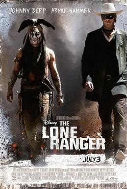
                        The Lone Ranger arrived in cinemas on July 3rd 2013 in the UK, starring Johnny Depp as Tonto, a spirit warrior, and Armie Hammer as John Reid, the protagonist of the plot. Based on a children’s story in the early 50’s, Disney wanted to revive The Lone Ranger by creating a modern day motion picture equivalent. First appearing on radio in 1933, The Lone Ranger is now an icon of American Culture. Centred around a super-hero who catches ‘bad guys’ and with celebrities including Johnny Depp and Helena Bonham Carter, as well as the music being composed by Hans Zimmer, many avid film watchers were expecting an ‘all-round feel good’ film. However, this film was not at all what it made out to be, in fact, it was a ‘Box Office flop.’

TheLoneRanger2013Poster.jpg      ‘Wallet Exhaustion’ was, in my view, the biggest problem for this failure. Too many box office hits were arriving on screen around the time of The Lone Ranger’s release, such as; Man of Steel, Despicable Me 2 and of course Monsters University. This meant that many film-goers had spent all their pocket money on these more enjoyable and more interesting films, therefore not feeling the need to spend even more money to watch something that wasn’t all that appealing.

      To initially find a film appealing, the trailer has to be informative, exciting and stimulating. This was not the case for ‘The Lone Ranger.’ The bland colour palette throughout the film is a sharp contrast to action films that the public are accustomed to nowadays. They are familiar with bright, strong and bold colours that depict so many action scenes today rather than the dull, cloudy and lifeless colour that The Lone Ranger portrays.

              
      Advertising plays a key role in the success of any film, if the movie is not advertised at all, the public will not hear about it consequently not going to see it. This is an exaggerated example of what could happen, however the rule still applies. The Lone Ranger’s trailer was vague and completely unfitting to the plot. It focused more on transport and inventions of trains than an actual hero who protects society. Yes, the overall preview looked professional and the narration was apt, but humans statistically remember twice the amount more when watching something rather than listening to a particular piece of information.  Similarly the main poster’s composition was careless. John Reid, the main character is positioned offset to the centre frame, and more weight is given over to Tonto, his sidekick. This was a poor move by the artists to try and get more people to watch the film by misleading them into thinking that Hollywood star, Johnny Depp is the protagonist. It made the film-crew look desperate from the very start.

             
                On the whole, The Lone Ranger as himself has been such a worldwide success it has even made itself a part of the American culture, immensely contrasted with The Lone Ranger motion picture. 

Tuesday, 17 September 2013

Avatar

“You are not in Kansas any more. You are on Pandora…”

 Avatar, the box office hit wonder which took on a whole new meaning of success. With both Academy Award winners’ director James Cameron and composer James Horner Avatar was said to be, just ‘a mediocre motion picture.’ How wrong they were...

It became the top-grossing movie of all time at the worldwide box office with almost $1.844 billion in ticket sales.

 Sam Worthington played the lead role of Jake Sully, a former marine who was paralysed in battle, whilst Zoe Saldana was casted to play Neytiri, the Na’vi who subsequently falls in love with Jake Sully. Director James Cameron intended to start the making of the film in 1997, the year Cameron’s Titanic was released. However the technology that Cameron needed to create Avatar was not available, so the script was put on hold.    
         
    To many, the storyline is extremely foreseeable and so once predicted, the film becomes uninteresting and dry. When looking ahead of this fact, I completely lose myself in an entirely different phenomenon. The language, culture and pure ingeniousness of James Cameron’s imagination are all contributing factors of why I put this motion picture so far above any other film that I have watched. The fact that the Na’vi language is an actual dialect and the culture is so similar to that of our own ancestors makes me imagine that such a world out there exists, consequently connecting me ever so more to the film.

The exceptionally believable aspects of everyday life on the planet of Pandora would not be possible or achievable without the incredible use of CGI and stunning imagery. The screenplay for Avatar also adds to the convincing and almost-lifelike qualities which the computer generated imagery has to offer.

When watching the film in IMAX cinema for the first time, the third dimension instantaneously brought me into Pandora itself. Instead of watching the film, I was experiencing it. This particular viewing obviously gave me a biased view of the film from the very start, as the whole experience, including the meal beforehand, premier seats and the whole 3D spectacle to it added to my liking of the film before it even started. Nonetheless, after watching it for the second time on DVD I began to appreciate the entirety of each frame. I noticed how no details in the background were forgotten, and with Avatar being an animated film, I realised at how difficult a job this must have been for the artists involved post production. This simple minuscule fact strengthened my appreciation of the film.

               
  With there being 3 more sequels, I cannot express my gratitude to James Cameron himself for that he has inspired me confirming that ‘the sky is not the limit’ and that for the whole 178 minutes of the film, I can lose myself in an entirely diverse, yet so natural, creation.